The fifth year that the charity has been in existence provided an opportunity to refresh the look and feel of the annual review.
It was felt that it should be celebration of five years work and achievements. It should be iconic and look visually different from previous years.
This was achieved by:
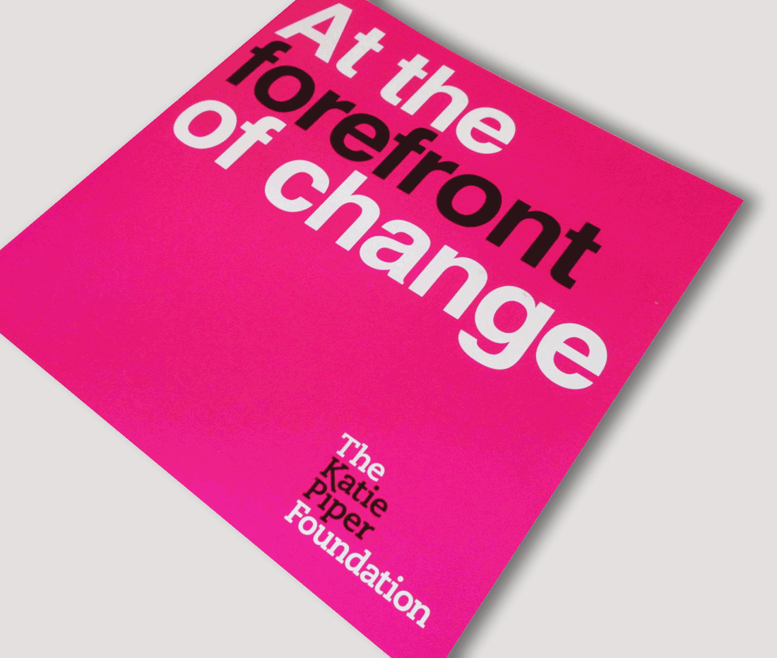
- Tweaking the brand by ‘turning up the volume’ of the rather subtle pinks and greys by making use of stronger, bolder colours such as 100% magenta.
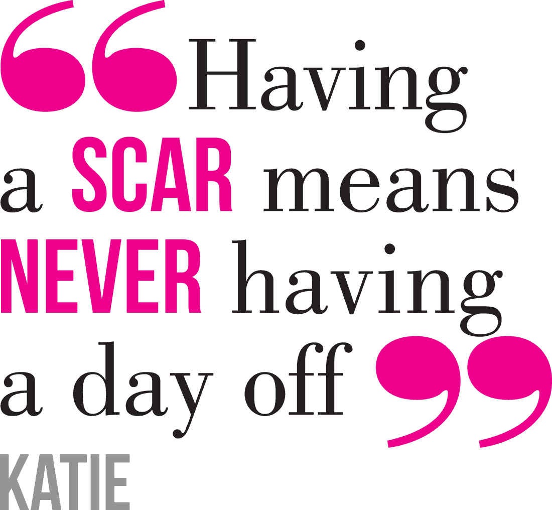
- Creative use of type as image – a big, strong, statement on the cover and a bold contemporary look for quotes scattered through the review - a big saving of time and costs usually associated with photography for a charity with a limited budget.
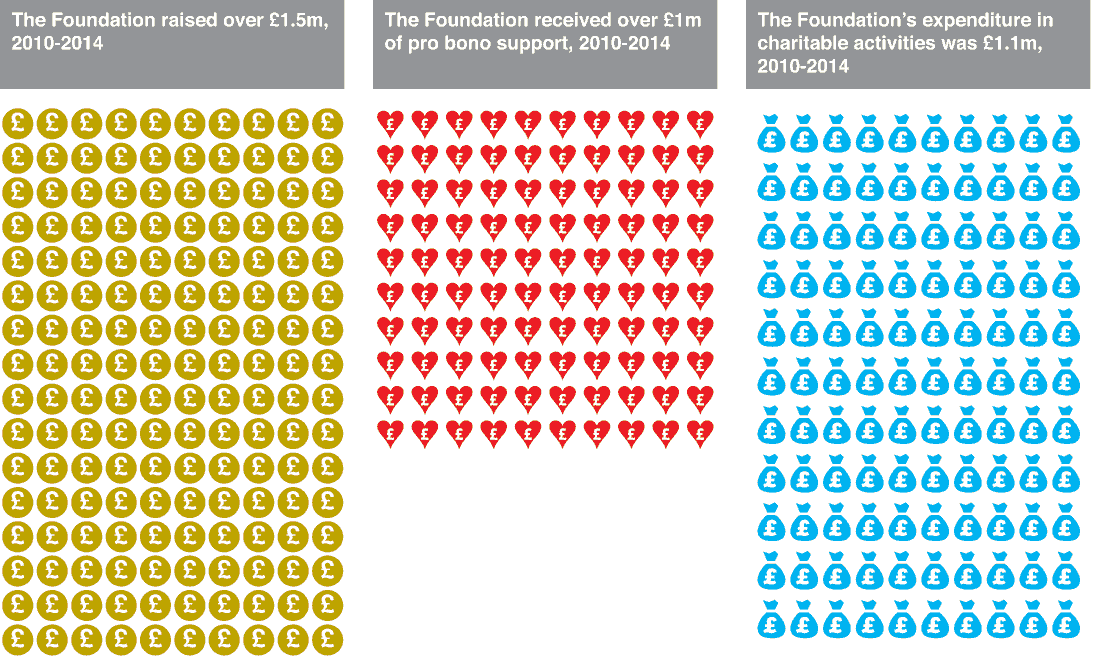
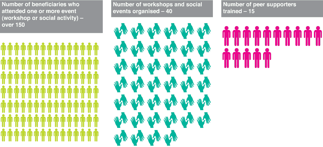
- Utilising infographics for facts and figures.
- Changing the format to a larger, more dramatic square shape.


